Back to Blog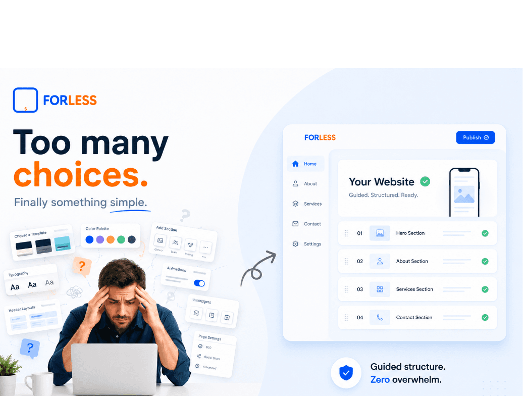
May 19, 2026
Most Website Builders Give Beginners Too Many Choices
Starting a Website Should Not Feel This Hard
A lot of people start building a website excited.
They have:
* a business idea
* a new service
* products to sell
* a side project
* a personal brand
They open a website builder thinking:
“this should be simple.”
Then suddenly everything feels overwhelming.
Too many buttons.
Too many layouts.
Too many menus.
Too many settings.
Too many things moving everywhere.
Most website builders give beginners unlimited freedom before they even understand what they actually need.
And honestly, that is usually the problem.
⸻
Most Beginners Do Not Want to Become Website Designers
Many people building websites are:
* local business owners
* freelancers
* creators
* small shops
* restaurants
* service businesses
* first-time founders
Most of them are not trying to become:
* professional designers
* UX experts
* SEO specialists
* developers
They simply want:
* a clean website
* mobile-friendly pages
* direct customer communication
* clear business information
* something professional enough to trust
But many website builders throw beginners into giant drag-and-drop systems filled with endless controls.
That creates stress immediately.
⸻
Too Many Choices Usually Create Worse Websites
This is something many platforms never talk about.
Unlimited customization sounds powerful.
But for beginners, it often creates:
* broken spacing
* messy layouts
* inconsistent colors
* confusing navigation
* poor mobile design
* cluttered sections
* random typography
A website can quickly start looking unprofessional even when the business itself is good.
This is one of the biggest hidden problems in modern website builders.
⸻
Most Small Businesses Only Need a Clear Structure
In reality, most business websites only need a few important things:
1. A strong homepage
2. A short About section
3. Features / Why Us
4. Services / Products
5. Clear customer contact tools
That structure alone can already create:
* trust
* clarity
* easier browsing
* better communication
* a more professional online presence
People do not want more complexity anymore.
They want clarity.
⸻
Why FORLESS Uses a Guided 5-Section System
FORLESS was designed differently from the beginning.
Instead of giving beginners a giant empty canvas, the platform guides users through a structured website flow:
1. Hero Section
2. About Us
3. Features / Why Us
4. Services / Products
5. Contact + Final CTA
This removes a huge amount of confusion automatically.
Users are not forced to constantly think about:
* where things should go
* how sections should be organized
* how spacing should work
* how layouts should balance
* how mobile design should behave
The system already helps structure everything automatically behind the scenes.
⸻
The Services / Products Section Solves a Real Problem
Many small businesses struggle to present their services clearly online.
FORLESS helps simplify this process through structured service and product cards where users can:
* add images
* add pricing
* customize CTA buttons
* add direct links
* organize products clearly
* regenerate visuals easily
This allows businesses to create cleaner pages without breaking the overall design.
Because the layout remains structured, the website continues feeling balanced and professional.
⸻
FORLESS Helps Prevent Ugly Websites
This is one of the biggest advantages of structured website systems.
FORLESS focuses heavily on:
* controlled layouts
* guided editing
* balanced spacing
* mobile-first structure
* clean typography
* visual consistency
The goal is simple:
help beginners create cleaner websites without needing design skills.
Instead of unlimited chaos, users get guided simplicity.
⸻
Most Customers Browse From Phones
Most visitors now browse websites directly from smartphones.
Simple structured layouts usually:
* load faster
* scroll easier
* improve readability
* make buttons easier to tap
* feel cleaner on smaller screens
FORLESS uses mobile-first layouts designed to stay clean across phones and tablets automatically.
⸻
The Internet Is Moving Toward Simpler Tools
A few years ago, people accepted complicated software.
Now many business owners are tired of:
* endless dashboards
* complicated editing systems
* subscription overload
* visual confusion
* overwhelming setup processes
People increasingly want tools that feel:
* fast
* calm
* guided
* beginner-friendly
* easier to understand
That shift is becoming much more visible online.
⸻
Most Business Owners Just Want to Publish Something Clean
Many people delay launching their business because building a website feels overwhelming.
But most businesses do not need giant complicated systems.
They simply need:
* a professional online presence
* customer communication tools
* mobile-friendly structure
* services or products clearly displayed
* something trustworthy
FORLESS focuses heavily on that exact experience.
⸻
Structured Simplicity Is Becoming a Huge Advantage
The future of website builders may not be “more features.”
It may actually be:
* better guidance
* cleaner structure
* less confusion
* smarter simplicity
That is the direction structured AI website systems are moving toward.
And honestly, many beginners prefer that experience much more.
⸻
Final Thoughts
Most beginners do not fail because they lack ideas.
They fail because modern website building often feels unnecessarily complicated.
Too many choices can slow people down before they ever publish anything.
FORLESS approaches website building differently through:
* guided sections
* structured editing
* controlled layouts
* mobile-first design
* simple publishing
* beginner-friendly workflows
* anti-chaos visual systems
Sometimes simplicity is not a limitation.
Sometimes simplicity is the real feature.
⸻
Ready to Build Something Simpler?
You do not need to learn complicated design systems to launch a professional website anymore.
FORLESS helps beginners create structured, mobile-friendly websites with guided sections designed to reduce confusion and simplify publishing.
Starting online should feel calmer.