Back to Blog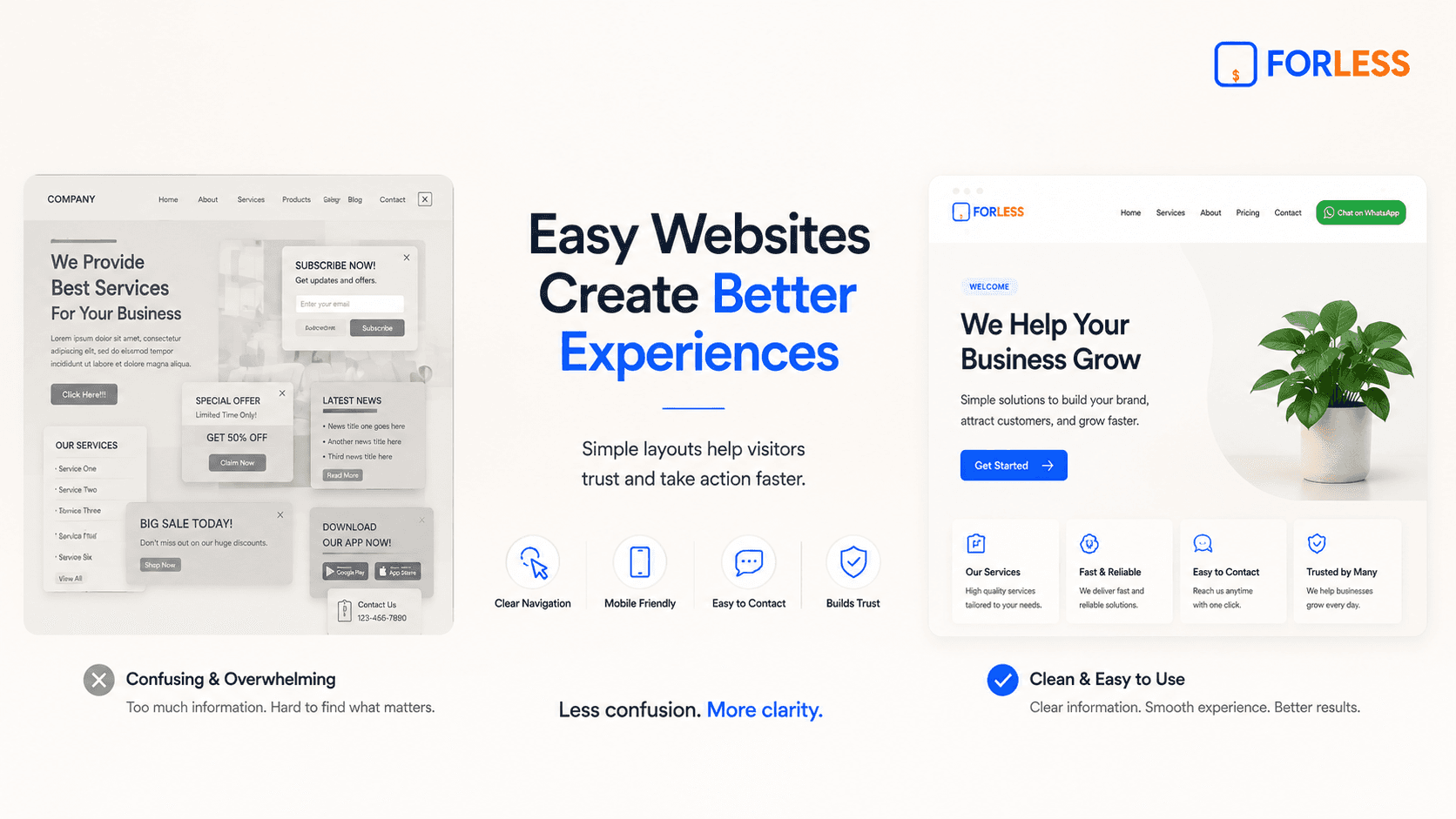
May 16, 2026
How to Make Your Website Easy to Use
Imagine walking into a physical retail store where the items are scattered across the floor, the signs are written in a confusing language, and the checkout counter is hidden somewhere in a back room. You would likely feel frustrated, turn around, and walk out immediately.
When a customer visits a digital storefront, they react the exact same way.
If your online layout is crowded, your links are hard to find, or your text requires zooming, visitors will click away to a competitor within seconds. Making your website easy to use—often called user experience—is the single most important factor in keeping people on your page and turning them into real customers.
Let's break down the practical steps to make your business website incredibly easy to navigate for anyone, especially beginners.
1. Put the Most Important Details First
When visitors open your website, they should not have to hunt for your operational details. The absolute top section of your homepage must clearly show the basic information people look for daily:
What specific service or product you provide
Your active business opening hours
Your physical location or delivery areas
A direct link or button to get in touch
By organizing your layout to display these details instantly, you answer your customer's primary questions before they even have a chance to think about closing the tab.
2. Use a Clear, Thumb-Friendly Mobile Layout
The majority of your local audience will look at your business profile using a smartphone screen. A layout that feels simple on a desktop computer can quickly become highly irritating on a small phone if it isn't properly scaled.
To make your website easy to use on mobile devices, focus on these details:
Large Fonts: Keep your paragraph text large enough so that anyone can scan it clearly without needing to pinch or zoom their screen.
Spacious Buttons: Make sure your buttons are tall and wide enough to be tapped comfortably with a thumb while holding a phone with one hand.
Generous Spacing: Leave ample white space between your images, headings, and text blocks so the screen feels calm, breathable, and organized.
3. Stick to Simple, Familiar Navigation
Some business owners try to get overly creative by using unique symbols or unusual phrases for their page links. They might label their services section as "Our Journey" or hide their phone number under a tiny icon.
Creativity is great, but clarity is always more profitable.
Stick to simple, highly recognizable words that your customers already understand. Use straightforward section titles like Services, Pricing, About Us, and Contact. When your layout is predictable and familiar, visitors feel confident exploring your page because they don't have to guess where a button leads.
4. Guide the Visitor to One Clear Next Step
An easy-to-use website never forces the visitor to guess what to do next. If you give a user multiple actions on a single page—such as subscribing to a newsletter, downloading an app, checking a gallery, and filling out a long form—they will experience decision fatigue.
Pick the absolute most valuable action for your business and make it the hero of your page. If your orders happen over chat, use one bold button that says Chat on WhatsApp. If your business depends on appointments, use Book Now. Make this primary action stand out visually so the customer always knows the exact next step to take.
Final Thoughts
An easy-to-use website does not require advanced animations, multi-layered menus, or complicated features. True ease of use comes from removing distractions and showing respect for your visitor's time.
By prioritizing crisp fonts, intuitive navigation, and a single, clear path to connect with you, you build an online presence that welcomes your audience, builds instant trust, and drives consistent results for your brand.
Ready to Start?
Describe your business, generate your website, and go online in minutes.